ShopEasy
Make Grocery Shopping Easy
Establishing User Needs through
Competitor Analysis
Several apps dedicated to shopping lists found already out there such as ShoppyList & Grocery Lists. These applications are not user friendly are made too complex. It is important to make an application of this type easy to use otherwise it is likely alternative/previous methods will be kept.
Alternative to this applications from bigger brands such as bunnings/coles/woolworths are better examples of more functional and user friendly apps. Despite this they are specific to their brand and don’t address all shopping.
User Interviews
Through conducting interviews with potential users, we were able to gain an understanding into personal experience, motivations and general behaviour.
The key take aways from this include;
Customer Journey Mapping
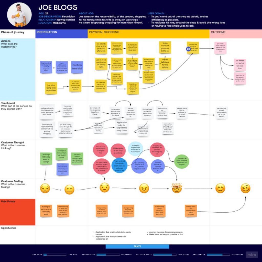
Through creating a customer map we are able to understand some of the process our target audience would undergo which would concern our human centred design solution, this is what we found:
Personas
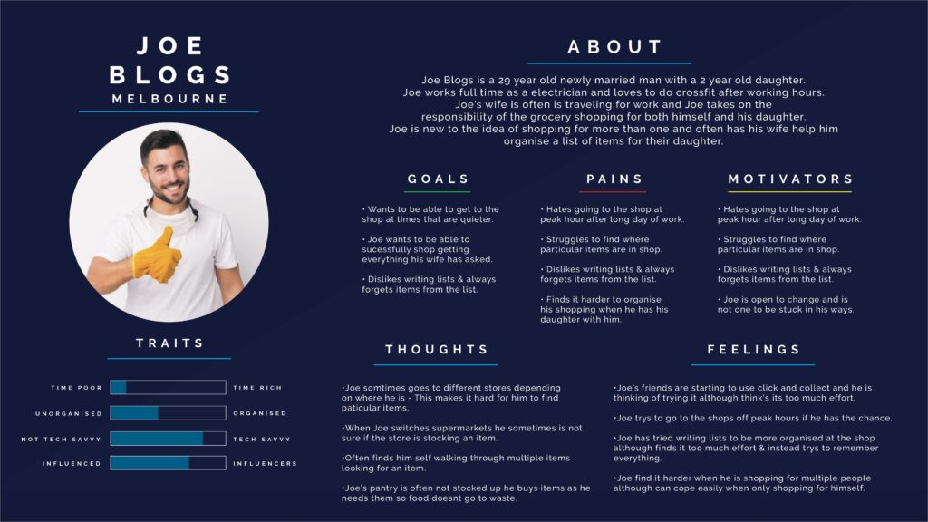
Creating a persona enabled a better understanding in thinking like the target audience. From this we can establish what the user goals/pains and motivations are.
MVP
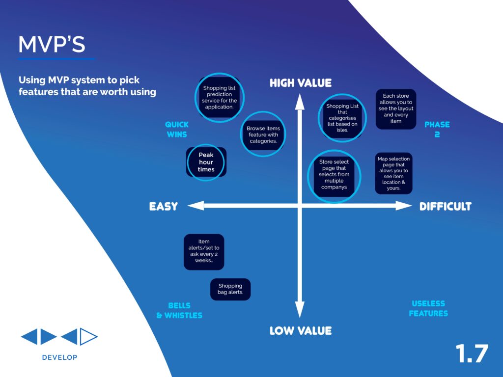
Minimum viable product system allows us to map out potential features for our platform. Mapping them on a chart based on value and difficulty enables us to judge whether or not it’s worth incorporating.
Using the data to drive a solution
After carefully sorting through the data, finding common themes and key areas we are able to begin the ideation process.
The ideation process begins with a wide scope of rough ideas that are derived from the organised data & ideas sparked by prompts.
Ideation
An ideation session took place we were able to rapidly brainstorm as many ideas as we could based on insights found in the interview process & previous research.
Users Flows
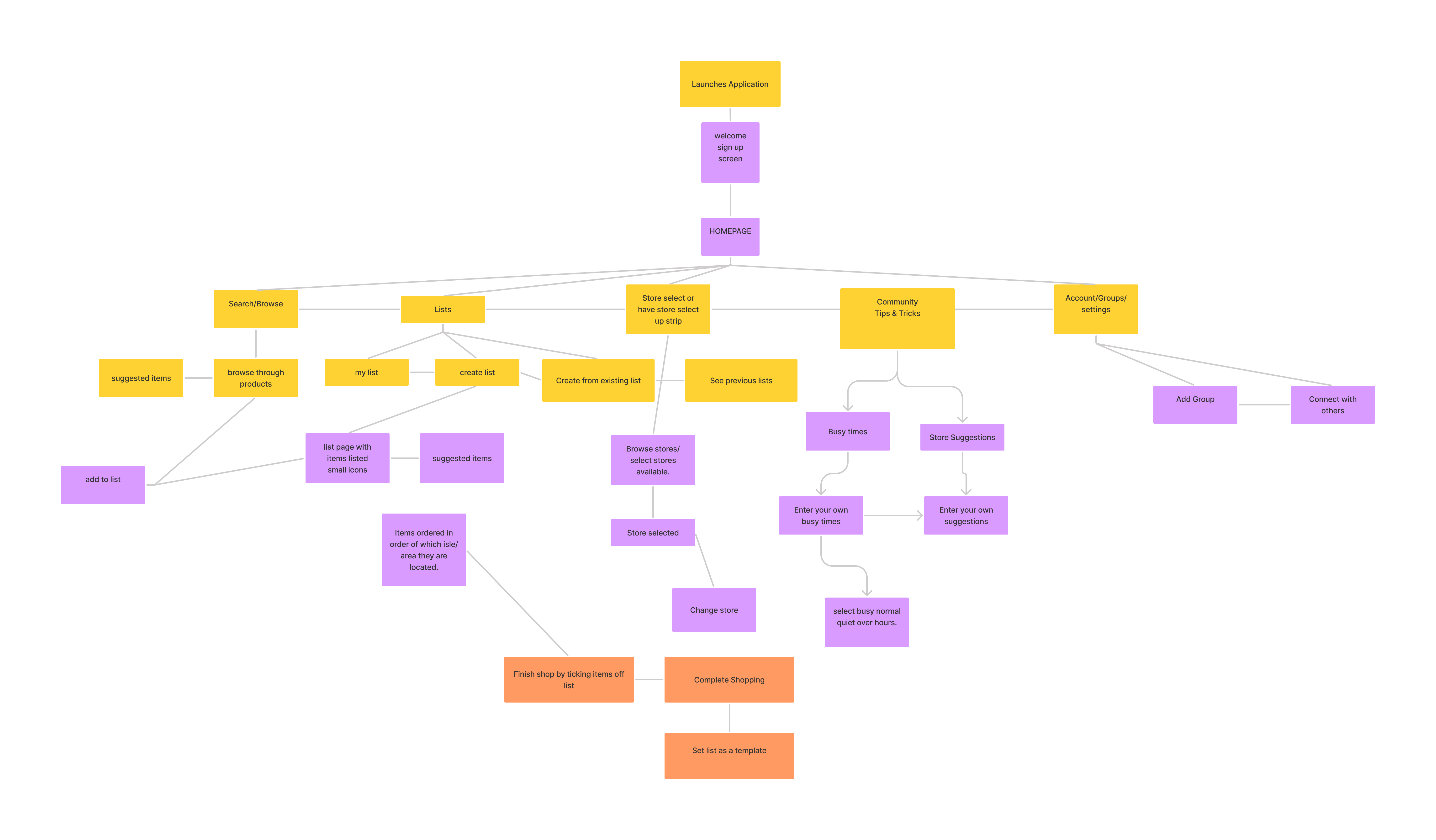
User flows feed off the ideation process allowing us to map out potential direction for the solution. The user flow below shows us the flow uploading content, this helps us to understand pages/actions & options at each step of the process.
Wireframes & User testing
After making sense of the user flows from the previous steps we began to create simple black & white wireframes that would lead the user testing stage. These screens would help drive our testing stage enabling us to narrow down what would work for our final design solution. From the testing phase we were able to understand the users:
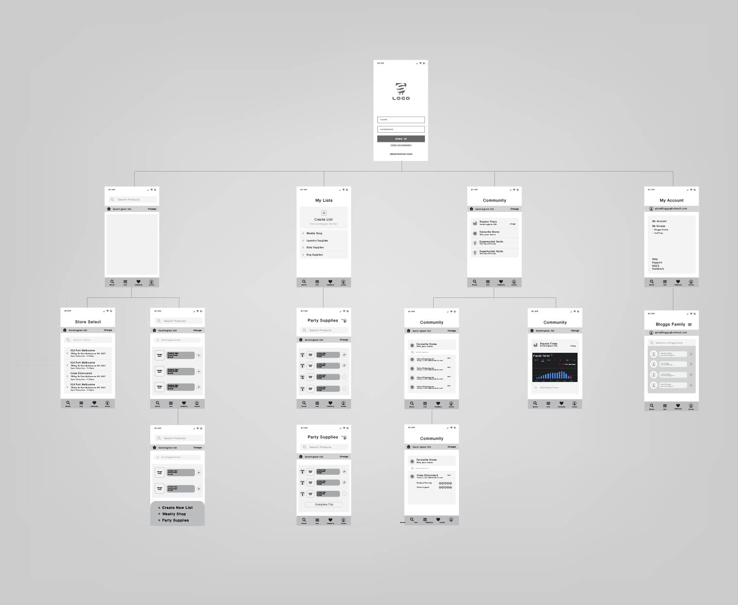
Users like to collaboration feature
One user was interested to see how the popularity times feature would work
Feedback & Moving Forward
ShopEasy Application Solution
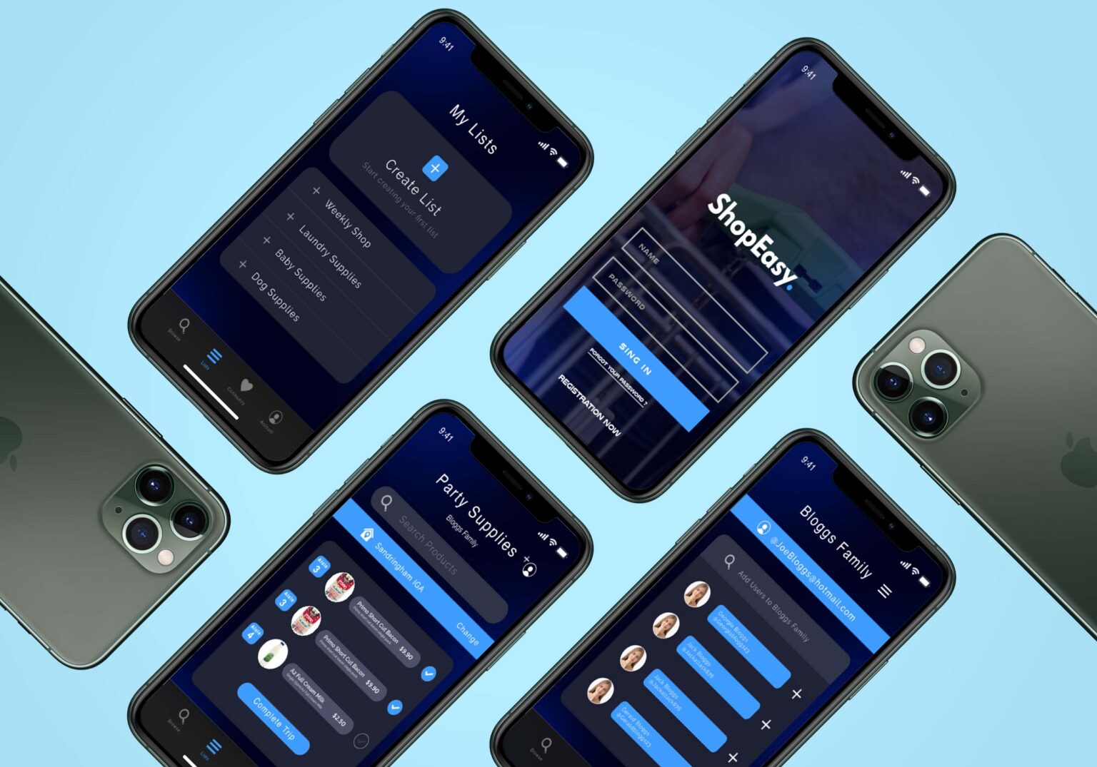
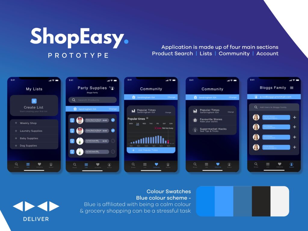
Shop Easy is a mobile application that aims to people become more organised in their weekly grocery shop. Grocery list’s are one more extra thing to remember and making an all inclusive application for users to list, organise and collaborate/share.
The application let’s users make pre-existing lists they can add to or use repeatedly.
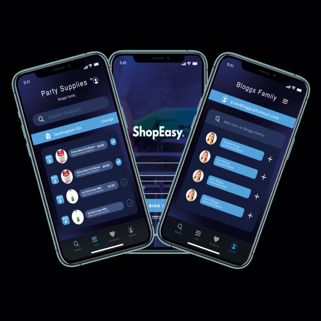
The app gives users the option to share lists with family/room mates and tick off what is needed and what isn’t which was found useful in the user testing phase.
